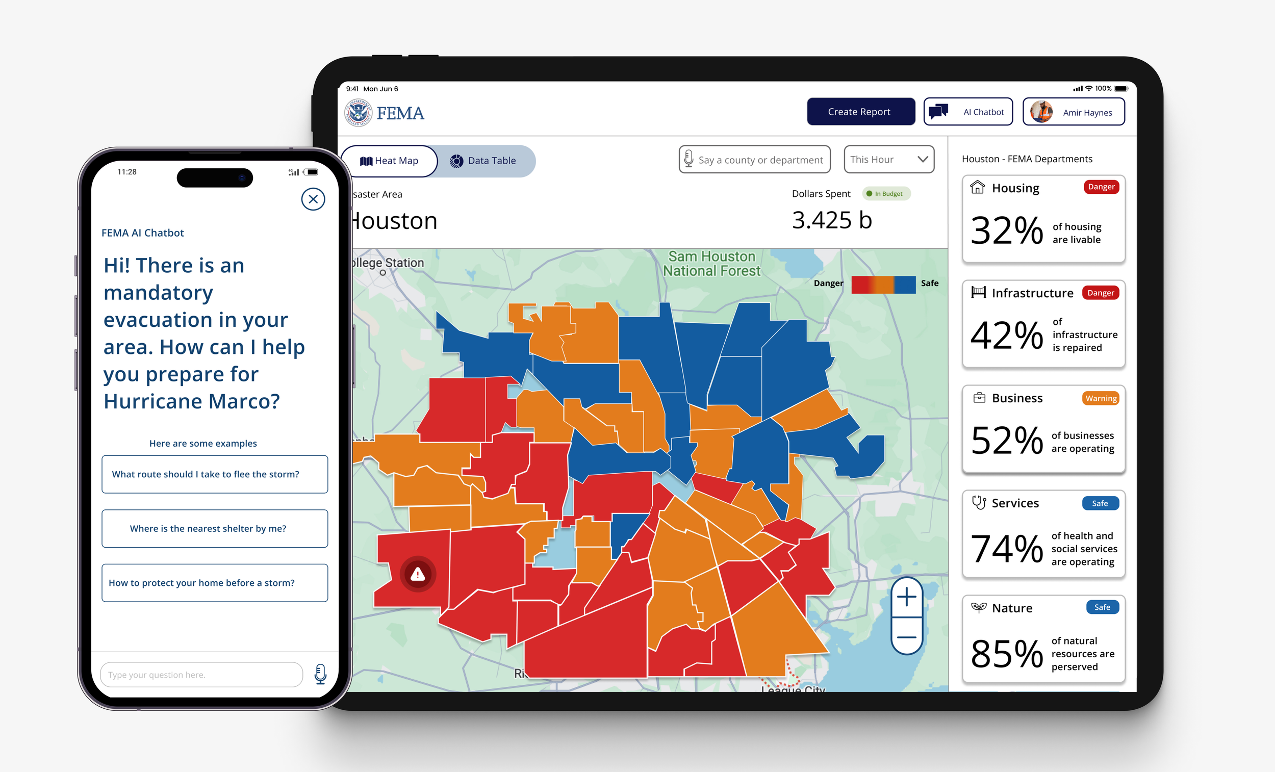
FEMA is a federal agency the helps people prepare and respond to natural disasters. This project is broken up into three parts: Research, Mobile Design, and Dashboard Design.
Course
Product, Services, Systems
Team
Solo Designer
Timeline
14 weeks
Takeaways
Interaction Design, UI and Composition, Prototyping
The Problem
Currently, FEMA faces scrutiny for its lack of transparency and disorganization, particularly in its response to recent crises such as the COVID-19 pandemic, Maui wildfires, and several major hurricanes.
The Solution
By exploring various mobile and dashboard interactions, I designed experiences that seamlessly aggregate information from FEMA and associated agencies into a user-friendly interface.
Prelude
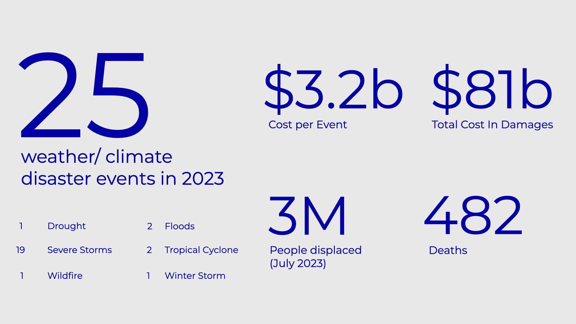
As global warming accelerates and yearly disasters increase, we urgently need a digital system to save lives and streamline recovery efforts. The data on natural disasters in 2023 demonstrates the rising number of catastrophes linked to climate change..
The Final Mobile Design
A chatbot that aggregates crucial information for disaster respondents in a single location
Based on secondary research and conversations with disaster victims, I designed a chatbot to help people find crucial information and help respondents prepare for a potential disaster
The Final Mobile Design
A personalized homepage and an interactive map that recommends the most needed information in real time.
Since information is changed when a disaster is approaching, the homepage, too, changes to the most relevant information as respondents prepare.
Final Dashboard Design
A cascade interaction that allows employees to narrow Into different areas and sectors.
Since the Situational Awareness Dashboard needs employees to observe the complex landscape, I created a cascade interaction to zoom in and out of a particular area or sector.
Final Dashboard Design
A map and data view that gives a holistic perspective of the affected area dashboard.
I developed a color-coded map to make the recovery process easy to scan and a data table showing the financial and demographic breakdown.
Research
Timeline
3weeks total
My Contribution
Secondary Research
Heuristic Evaluation
Research: Problem
FEMA has a mobile experience; however, it's merely a shell, linking to their other associated sites. Additionally, it was difficult to conduct discovery of the FEMA recovery dashboard because it's proprietary.
Research: Outcome
By conducting secondary research and performing a heuristic evaluation of the mobile app, I was able to create two proto-personas—one for mobile and one for the dashboard—to guide my decisions.
01: Research Process
Within the FEMA mobile experience, I identified severe issues; repetition of information, broken pathways, and unrecognizable patterns.
The app had severe issues with providing inadequate information, linking outside of the app, and not transparently handling the application process.
02: Research Process
Personas for a hurricane respondent and FEMA employee were created using forecasting and informal conversations.
Using WSGN Persona Future Forecasting and informal conversations with family members from New Orleans, Louisiana, developing personas for a mother responding to a hurricane evacuation and a FEMA employee tasked with tracking the recovery process based on severity and diversity for funding and distribution.
Mobile Design
Timeline
4 weeks
My Contribution
Mapping, Interaction Design, UI Design, Testing
Mobile: Problem
In emergencies, people must quickly gather information from various sources like the internet and news to determine their next steps, which creates confuses for respondents in a complex FEMA system.
Mobile: Outcome
I hypothesized a solution that aggregates information from FEMA and its associated agencies using AI capabilities to direct locals to the appropriate information for preparing for an upcoming disaster.
01: Design Process
Design system ensures consistent FEMA branding.
Keeping with the FEMA brand, I designed a well-crafted design system to promote consistency and ensure a cohesive user experience.
02: Design Process
My initial wireframes focused on the main user flow, but also needed to consider disaster responders - busy individuals managing multiple tasks during emergency preparations.
During a peer feedback session, we presented designs and exchanged feedback. While I initially focused on alerts for engagement, I received valuable suggestions on other aspects:
How might we:
• Prioritize the chatbot for information retrieval?
• Provide quick insights without extensive reading?
• Effectively display application status?
• Map various data points visually?
03: Design Process
My solution was a chatbot that aggregates all information to the app.
To solve the problem, I mapped out at a high level the key needs when responding to a disaster and how it aggregates into the chatbot.
Mobile Design: Draft
AI Chatbot Flow
.I developed a chatbot experience that recognizes its limitations as a chatbot. It guides the user, sifts through FEMA's data to present the most relevant information, and allows enhancement feedback.
Mobile Design:Draft
Notifications
The notifications alert respondents in real-time, guiding them through the experience and making them aware of FEMA's crisis preparation and recovery process.
Mobile Design: Draft
Personalized Homepage
The chatbot is part of an improved experience with a personalized homepage. The personalized homepage shows crucial details and navigation aids and provides access to key items like an interactive evacuation map for storms, assisting in preparation and locating essential needs.
Mobile Design: Draft
Audible Articles
Rather than reading the articles on the site, I created an experience that allows users to listen to and follow along with audio detailing essential information while preparing for a disaster.
Usability Testing Findings
From 28 feedbacks via Maze, 13 found it exceeding expectations. However, users struggled to find articles within the chat feedback and wished to discuss the evaluation map in the chat.
“Seeing the emergency notification and using the chatbot to get important information was very useful.” -Tester from Maze
“I think this would be helpful to aid people in a natural disaster. It connects people to resources they need fast without waiting on hold.” -Tester from Maze
AI Chatbot Flow Revised
Mobile Design: Final
Because of the test results, I redesigned the experience, allowing the respondents to click and listen to the audio articles. Once they do so, they can provide feedback, ask another question, or access other app parts.
Mobile Design:Final
Additional Chatbot Flow
While respondents can navigate to other parts of the app to find information, they prefer to ask the chatbot another question about the evaluation route instead of leaving the experience. Therefore, I included an extra question for the hero flow in the demo.
Mobile Design:Final
FEMA Application Status
On the Homepage, I show the FEMA application status, map view, and recommended articles before, during, and after a disaster, customizing the sales rep's experience.
Dashboard Design
Timeline
7 weeks
Artifacts
Mapping, Interaction Design, UI Design, Testing
Dashboard: Problem
Beyond FEMA's staffing shortage, the government's disaster response involves over 30 different agencies, complicating the coordination of recovery efforts with the local and state government.
Dashboard: Outcome
I proposed a solution for FEMA leaders to manage disaster-affected regions. It tracks recovery using metrics, monitors urgent needs, and assigns tasks to workers.
01: Design Process
The government collaborates with over thirty federal agencies and partners with local and state governments.
The government collaborates with over thirty federal agencies and partners with local and state governments. I thoroughly reviewed multiple documents and analyzed how FEMA monitors seven key areas: Infrastructure Systems, Disaster Recovery Centers, Natural Resources, Health and Social Services, Operations, Business, and Housing
02: Design Process
Based on secondary research, I sketched and designed multiple dashboard iterations.
Designing the dashboard proved more challenging than the mobile interface. Despite understanding the basic layout, I found it difficult to effectively illustrate the relationships between sectors and affected areas while presenting all the complex information.
Dashboard Design:Draft
FEMA Recovery Dashboard
It shows recovery and FEMA department progress in a specific location.
Dashboard Design:Draft
Cascade Interaction
FEMA employees can use the dashboard's map and recovery data points to delve into a specific county and review the recovery efforts in each sector.
Dashboard Design:Draft
Detailed Page
It showcases all applicant’s requests and needs.
Dashboard Design:Draft
Detailed Page Experience
I presumed that employees would be working with multiple victims. Therefore, I created an experience similar to Gmail, using dropdown checkboxes for multi-selection and initiating various actions.
Usability Testing Findings
Testing my concept with two former FEMA contractors and a product manager revealed that FEMA tracks fund distribution by neighborhood demographics for equity. Employees choose files on a first-come, first-served basis rather than receiving assigned cases.
03: Design Process
Added colors visualize disaster severity data.
Additional colors and components were needed to visualize the severity of the disaster and the data for money dispense.
Dashboard Design:Draft
Data Table
I revised the experience by adding a data table to view the department and demographic breakdown, showing real-time money spent, demographics per neighborhood, and internal data points.
Dashboard Design:Draft
Alert Feature
.I added an alert feature to direct employees to urgent issues and updated the visuals
Dashboard Design:Draft
Tab Interaction
I designed tabs that allow the employee to switch between map view and data table view.
Dashboard Design:Draft
Detailed Page Redesigned
From testing, I learned that employees view the files and make updates as needed but do not receive work assignments.
Lessons Learned
-
Validating Assumptions
Due to the absence of a FEMA dashboard, I relied on secondary research to inform my approach. Concept testing was crucial in understanding the tool's actual requirements from experts. This process led me to gather facts to refine my work, validating design assumptions throughout.
-
Creating A Visual System
As a UX Designer, I expanded beyond my usual black-and-white wireframes for this project. I delved into visual design, exploring the intersection of UX and UI. Drawing from my FEMA brand design experience, I experimented with colors, typography, and systematic design approaches.
-
Simplifying a Complex System
FEMA coordinates over thirty agencies, working with state and local governments to manage funding, disaster preparation, and recovery. I mapped out these complex systems to create user-friendly visualizations of the response and recovery process.


